new brand / launched 2016
market research / brand strategy / logo design / packaging design / retail design
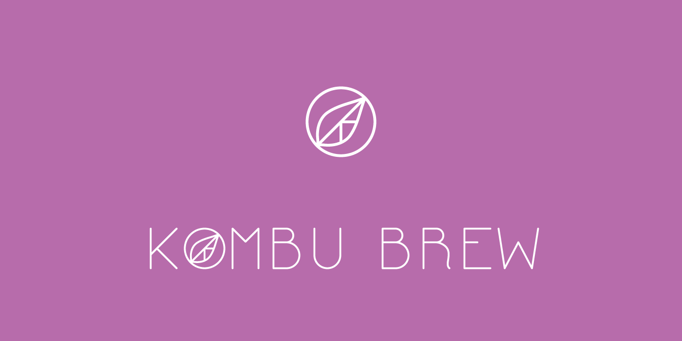
Kombu Brew
new brand / launched 2016
market research / brand strategy / logo design / packaging design / retail design
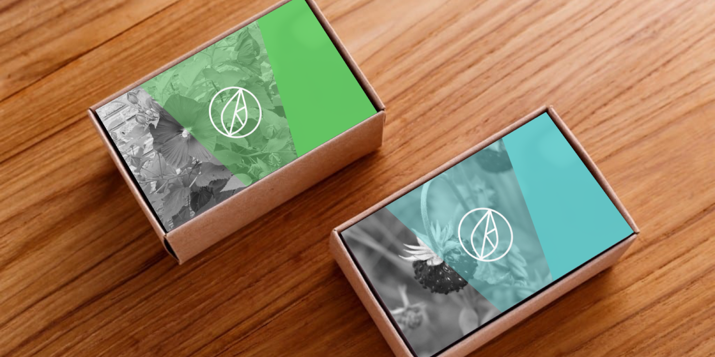
kombu brew is a new kombucha tea drink with the mission to meld traditional Russian/Chinese methods of kombucha brewing with modern flavors through hand-foraged elements to the every day tea drinker. we combined a lot of tricks, ideas, and inspiration to make a dominant but refreshing identity to own it's place on a shelf. the goal was to have an extra focus on consistent details to let the packaging show a natural journey of individual elements that, when brewed into kombucha, became bright and colorful.
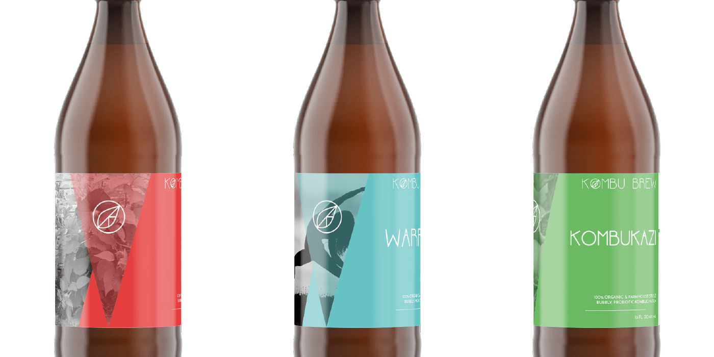
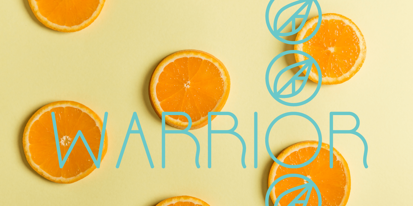
we knew that to get attention, we needed a big idea. the logo, custom typography, and marketing materials for kombu brew is bright, bold, exciting and delivers exactly that. the usage of color - greyscale to solid colors - was an intentional dialogue to convey that common ingredients can come to life.
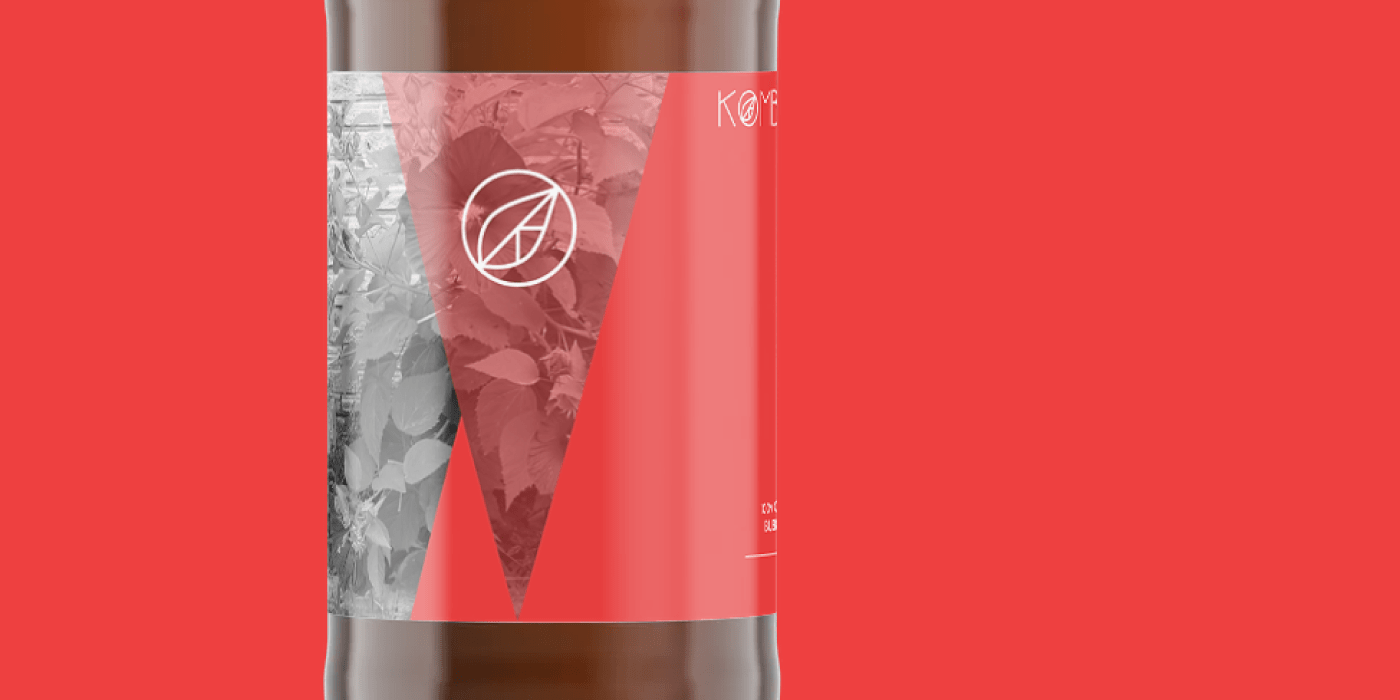
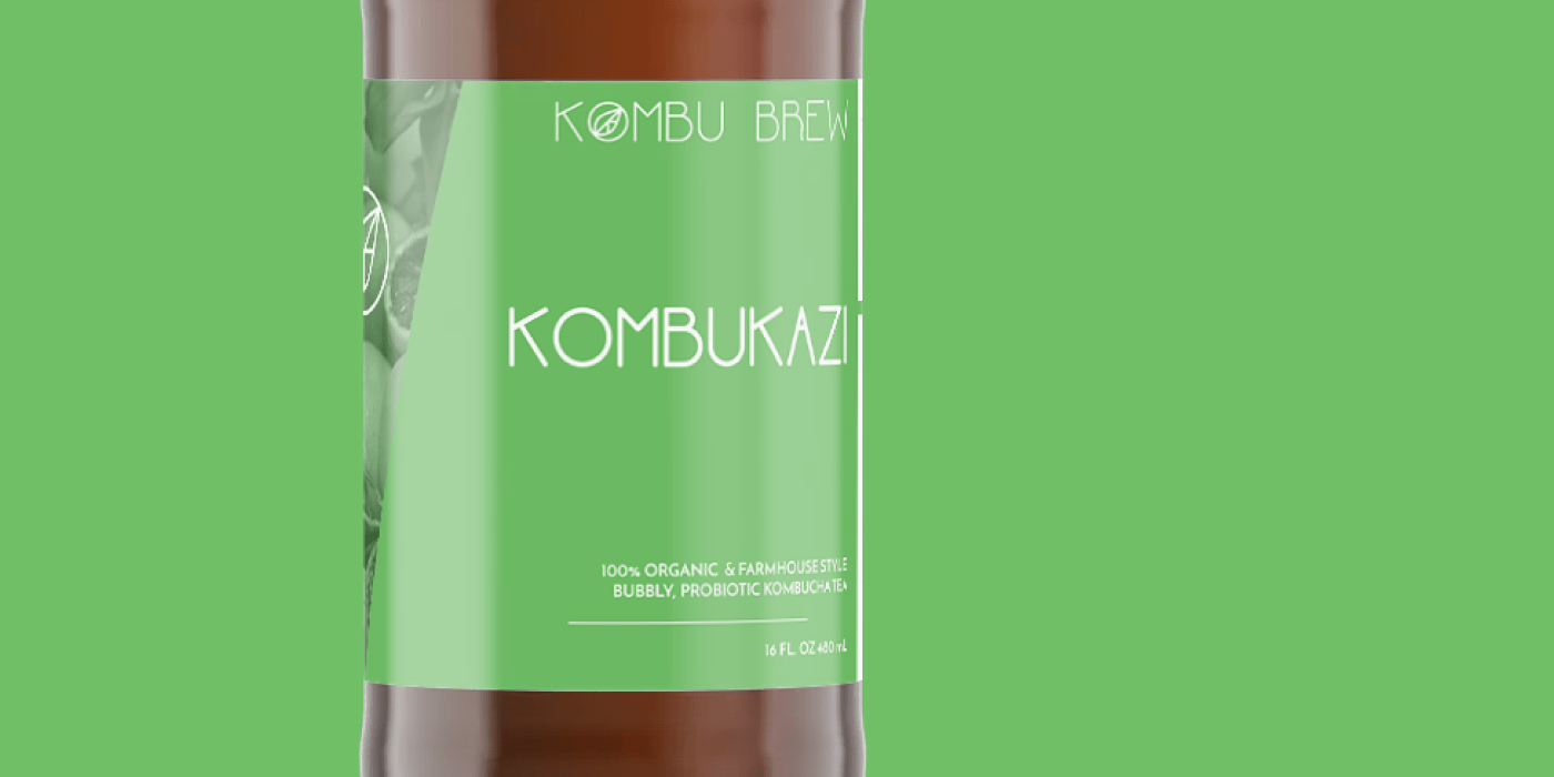
the logo itself was specifically developed from the beginning to be light-weight and adaptative to almost any color palette or visual setting. the color palette lets customers identify their favorite flavors at a glance and the custom typography goes a long way to set the tone, whether on the bottles themselves or on marketing materials.
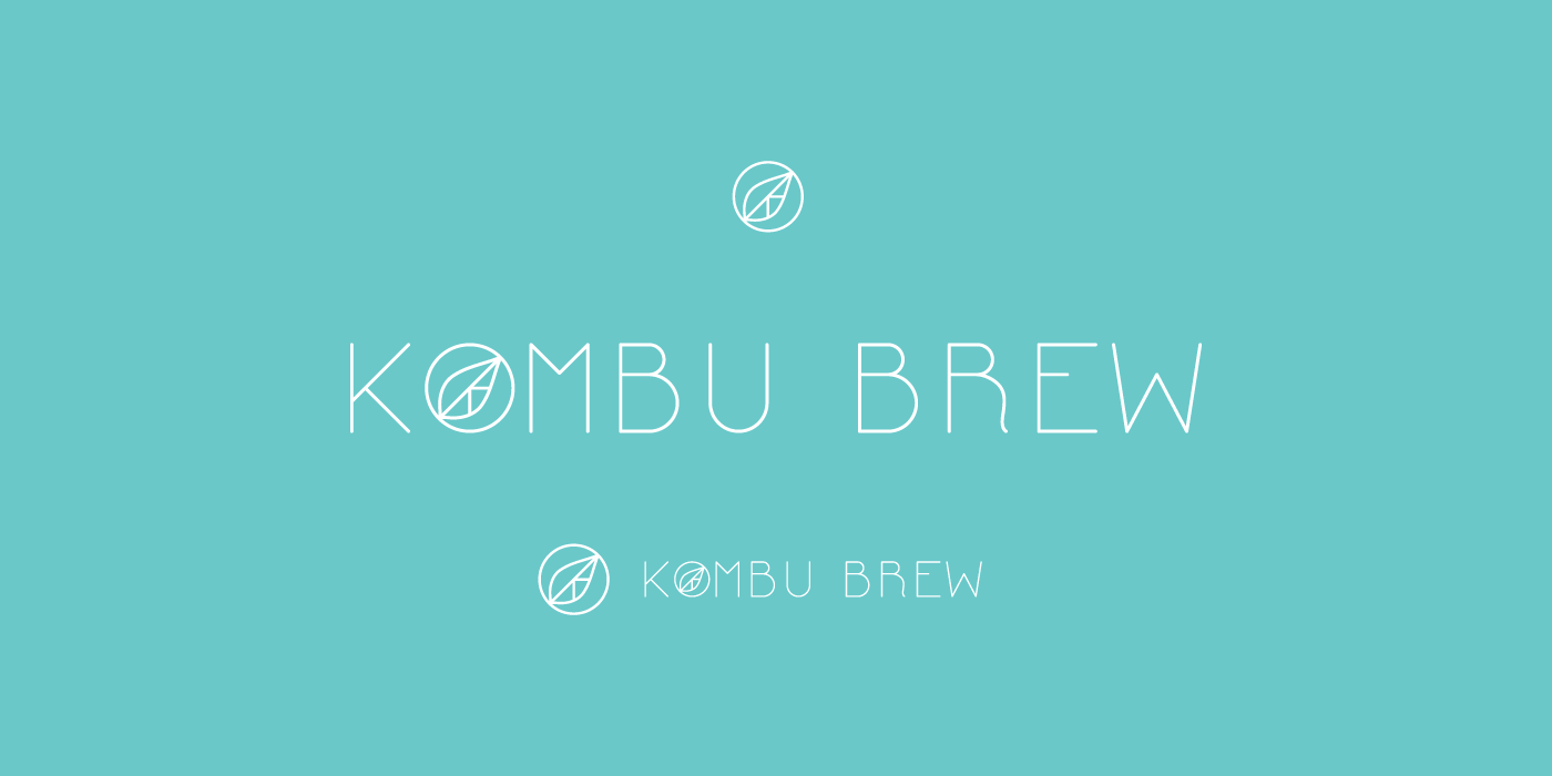
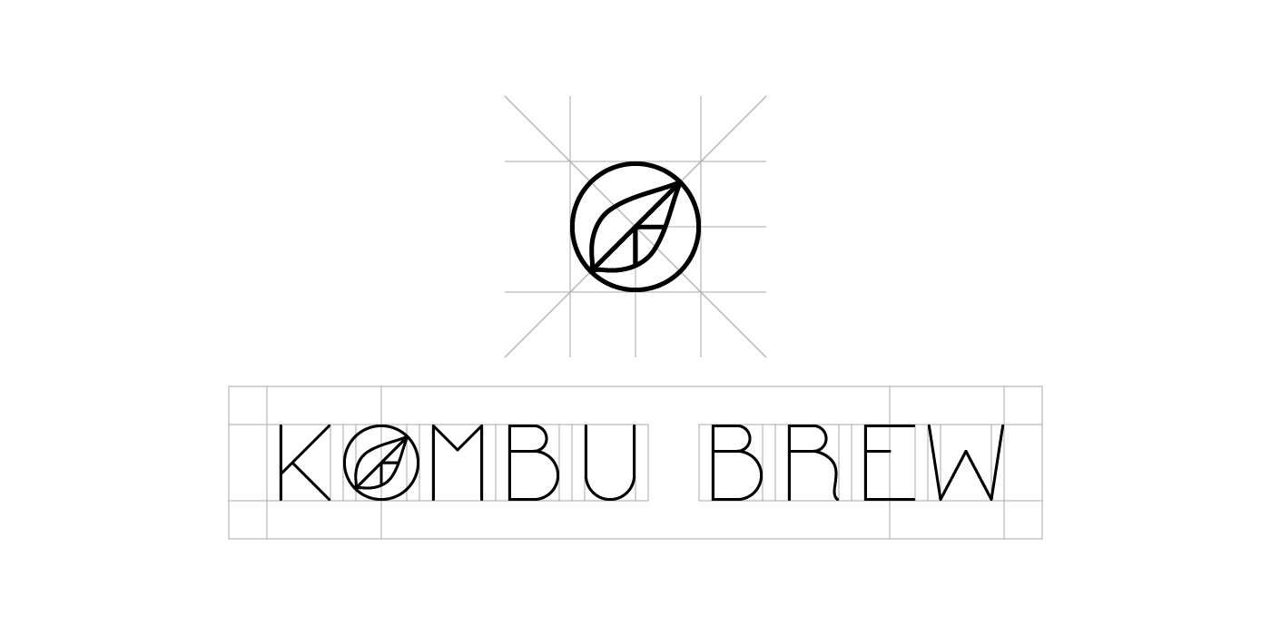

custom-designed font, "Kombu Gothic Sans", made by our team from the ground up